Work
About
Contact
Mit Formuepleje
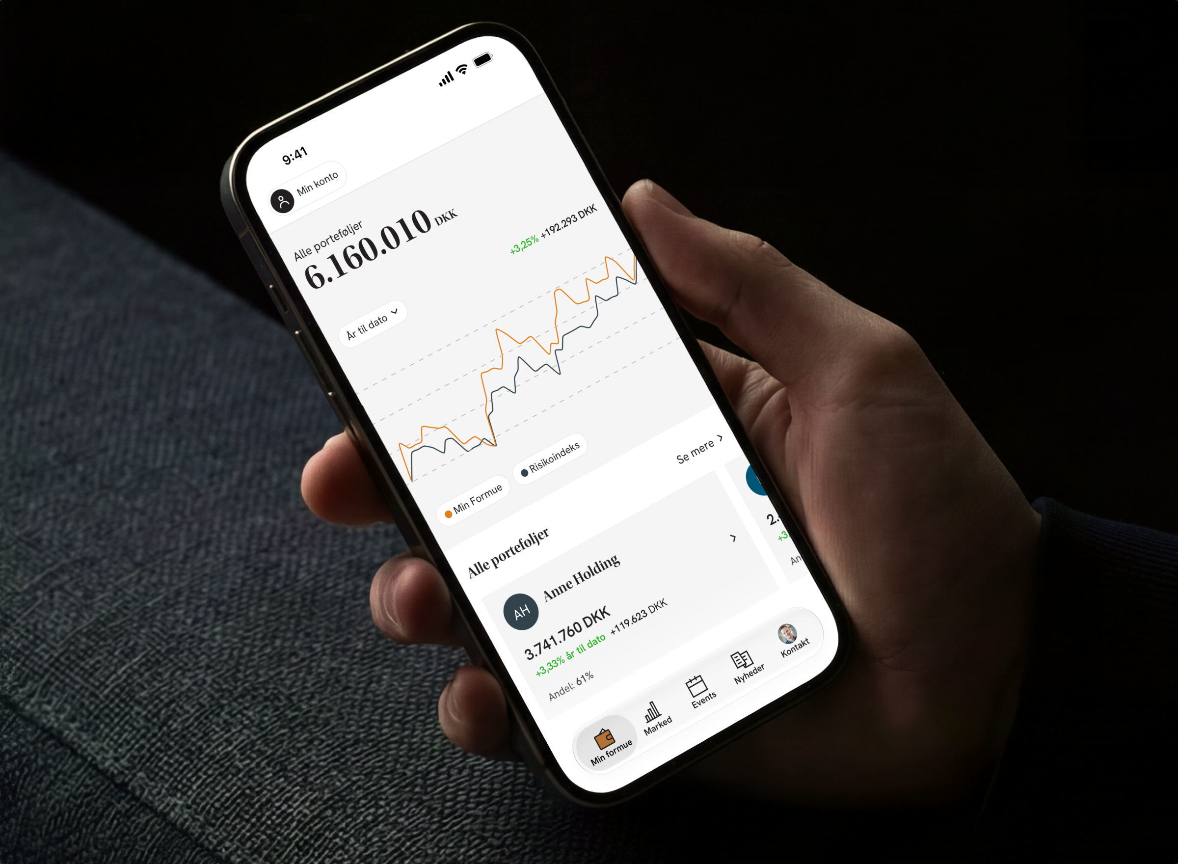
The entire Formuepleje universe, in one app. Mit Formuepleje gathers investments, market insights, events and a direct line to your advisor in one place. Our goal was to make a complex financial world feel calm and easy to understand, and to give clients a fast overview on the go, with the option to dig deeper when they want to.
Client
Formuepleje
Project type
Fintech
My role
UX prototyping, UI design
The challenge
Investment data is dense. A single client can have several portfolios, each with its own depots and underlying securities, and returns, risk and allocation all change over time. On top of that, clients use the app for much more than numbers: market news, events, benefits and contact with their advisor. Most of them open the app briefly, to check in, not to analyse. The challenge was to give them the answer to "how am I doing?" in seconds, without hiding the detail for those who want to understand why.
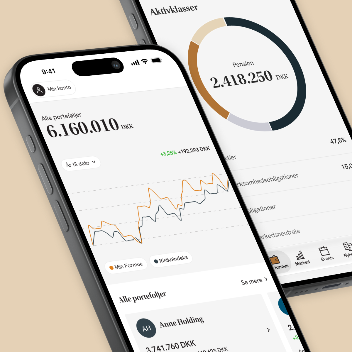
Most visits are a quick check-in: how is my wealth doing?
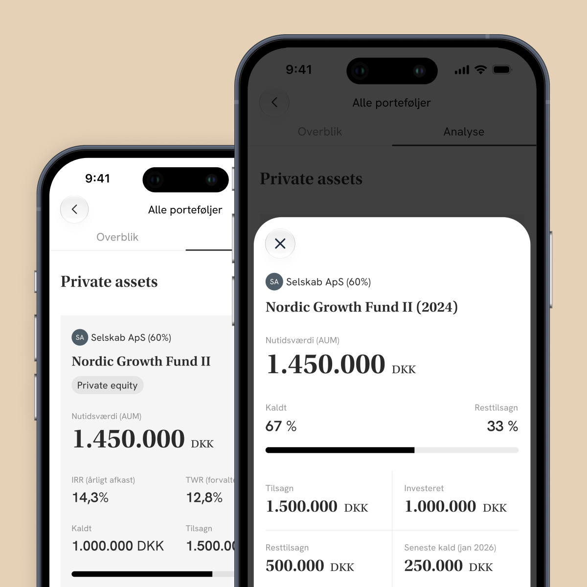
But the detail has to be there for those who want to dig deeper.
The solution
We built the app around one simple principle: overview first, detail on demand. The front page answers the big question with the total development and a clear graph, and from there clients can drill down step by step, from portfolios to depots to the actual underlying securities. Working closely with Formuepleje's team, we put a lot of effort into graph visualisation and filtering, so time periods and comparisons are only a tap away. The same patterns carry over to the market section, where clients can explore stocks, bonds and mixed funds and compare them with their own investments.
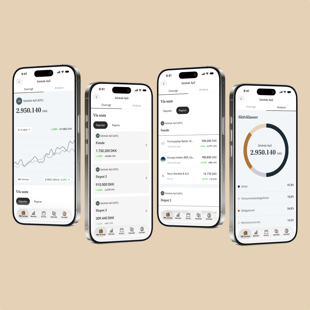
From the big picture to the underlying securities, one level at a time.
More than numbers
Next to the numbers sit the things that make Formuepleje personal: news and analyses by theme, events you can join with one tap and add to your calendar, and a direct line to your advisor. All in the same place as the investments.
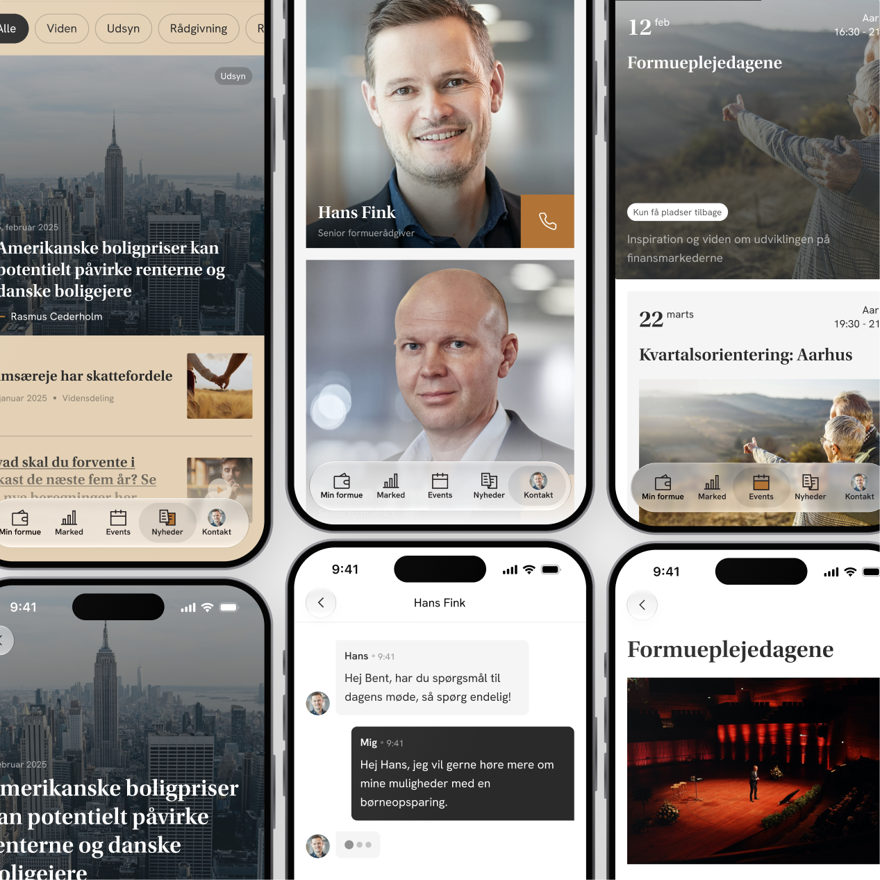
More than numbers: events, news by theme, benefits and advisor contact, as the human side of the app.
Let’s say hej
in real life.
Mit Formuepleje
The entire Formuepleje universe, in one app. Mit Formuepleje gathers investments, market insights, events and a direct line to your advisor in one place. Our goal was to make a complex financial world feel calm and easy to understand, and to give clients a fast overview on the go, with the option to dig deeper when they want to.
Client
Formuepleje
Project type
Fintech
My role
UX prototyping, UI design
The challenge
Investment data is dense. A single client can have several portfolios, each with its own depots and underlying securities, and returns, risk and allocation all change over time. On top of that, clients use the app for much more than numbers: market news, events, benefits and contact with their advisor. Most of them open the app briefly, to check in, not to analyse. The challenge was to give them the answer to "how am I doing?" in seconds, without hiding the detail for those who want to understand why.
Most visits are a quick check-in: how is my wealth doing?
But the detail has to be there for those who want to dig deeper.
The solution
We built the app around one simple principle: overview first, detail on demand. The front page answers the big question with the total development and a clear graph, and from there clients can drill down step by step, from portfolios to depots to the actual underlying securities. Working closely with Formuepleje's team, we put a lot of effort into graph visualisation and filtering, so time periods and comparisons are only a tap away. The same patterns carry over to the market section, where clients can explore stocks, bonds and mixed funds and compare them with their own investments.
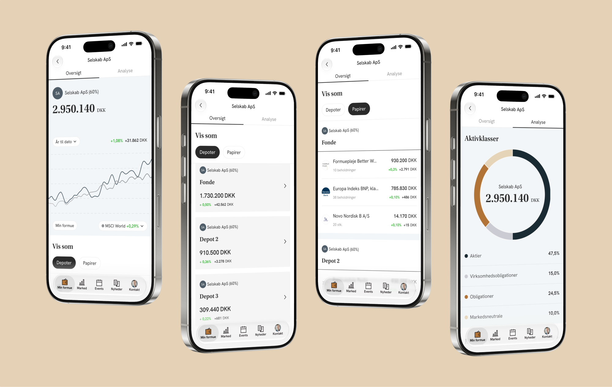
From the big picture to the underlying securities, one level at a time.
More than numbers
Next to the numbers sit the things that make Formuepleje personal: news and analyses by theme, events you can join with one tap and add to your calendar, and a direct line to your advisor. All in the same place as the investments.
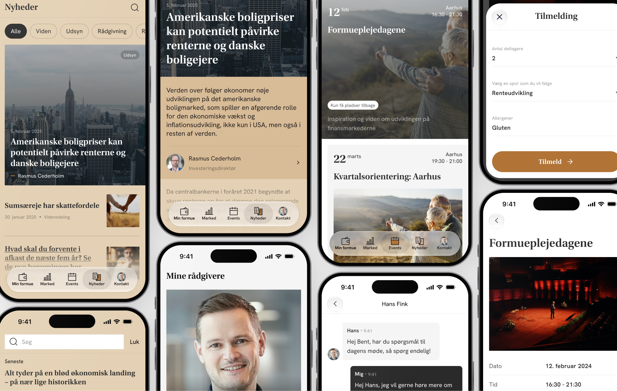
More than numbers: events, news by theme, benefits and advisor contact, as the human side of the app.
Let’s say hej in real life.
Mit Formuepleje
The entire Formuepleje universe, in one app. Mit Formuepleje gathers investments, market insights, events and a direct line to your advisor in one place. Our goal was to make a complex financial world feel calm and easy to understand, and to give clients a fast overview on the go, with the option to dig deeper when they want to.
Client
Formuepleje
Project type
Fintech
My role
UX prototyping, UI design
The challenge
Investment data is complex. A single client can have several portfolios, each with its own depots and underlying securities. Returns, risk and allocation also change over time.
On top of that, clients use the app for much more than tracking numbers: they can follow market news, explore events and benefits, and contact their advisor.
Most clients open the app briefly to check in, not to analyse their investments. The challenge was to answer the question, “How am I doing?” within seconds, without hiding the details for those who want to understand why.
Most visits are a quick check-in: how is my wealth doing?
But the detail has to be there for those who want to dig deeper.
The solution
We built the app around one simple principle: overview first, detail on demand. The front page answers the big question with the total development and a clear graph, and from there clients can drill down step by step, from portfolios to depots to the actual underlying securities. Working closely with Formuepleje's team, we put a lot of effort into graph visualisation and filtering, so time periods and comparisons are only a tap away. The same patterns carry over to the market section, where clients can explore stocks, bonds and mixed funds and compare them with their own investments.
From the big picture to the underlying securities, one level at a time.
More than numbers
Next to the numbers sit the things that make Formuepleje personal: news and analyses by theme, events you can join with one tap and add to your calendar, and a direct line to your advisor. All in the same place as the investments.
More than numbers: events, news by theme, benefits and advisor contact, as the human side of the app.
Let’s say hej in real life.